How the 13 Principles of Design Can Improve Your Art
Table of Contents
Recent Articles
Design is all around us—from the websites we browse to the packaging of our favorite snacks. But what makes some designs stand out while others fall flat? The answer lies in the principles of design.
Learning the principles of design is about more than just making things aesthetic, it’s about helping people understand your message through design. By knowing how to balance elements, create contrast, and organize information, you can make designs that grab attention and share your message.
In this blog, we will explore the twelve principles of design in simple terms. So even if you’re a beginner, you’ll know how these principles can improve your designs by the end.
What Are the Principles of Design and Why Are They Important?
Let’s start with understanding what the principles of design are. Think of them as a set of rules that ensure that your design is balanced, organized, and aesthetically pleasing.
These principles are not just there for decoration; they play a vital role in how people interact with your design. They create flow and structure, guiding the viewer’s eye across the design and helping them focus on the most important elements.
But why are they so important?
Because design isn’t just about looking pretty—it’s about communication. The way you arrange your elements can drastically affect how your message is received.
Imagine trying to read a website where the text is all over the place, or a flyer where the colors clash. It would be hard to know where to look, right? That’s where these principles come in.
They help create a visual language that makes your design easy to understand.
Quick Overview of Design Elements:
Before we dive into the principles, it’s helpful to understand the elements of design. These are the basic components that make up any design:
- Line: This could be straight, curved, thick, or thin—lines are used to guide the viewer’s eye across the design.
- Shape: Think of basic shapes like circles, squares, and triangles, or more complex ones. They create structure and organization.
- Size: The scale of an element relative to others. It creates hierarchy and emphasis, helping to direct attention where it’s needed.
- Color: Color affects mood and draws attention. The right color combinations can evoke specific emotions and reactions.
- Value: Refers to the lightness or darkness of a color or element. It adds contrast, helping to create depth, mood, and focus within the design.
- Texture: Texture adds depth, making a design feel more tactile, even on a flat surface.
- Space: Space refers to the areas around and between elements, which can help keep things from feeling cluttered.
- Typography: Arranging the letterforms in a readable and visually appealing manner.
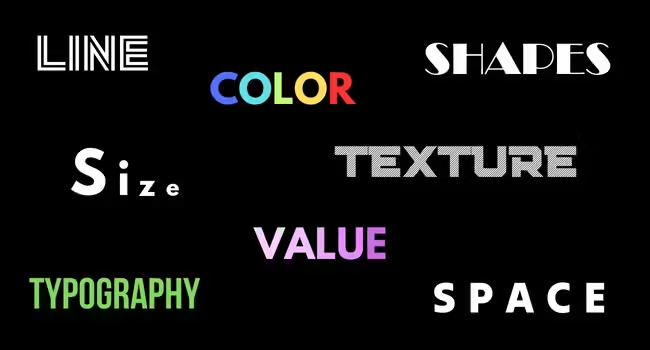
These elements are the building blocks, but the principles of design tell us how to use them effectively.
The 13 Principles of Design Explained
1. Balance
Balance is one of the most fundamental principles in design, and it refers to the way different elements are arranged to create a feeling of stability and harmony. Imagine trying to stand on one leg for a long time—you’d eventually fall over. Similarly, if a design feels “unbalanced,” it can be jarring for the viewer and difficult to navigate.
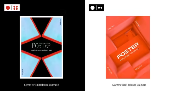
There are two main types of balance:
- Symmetrical Balance: This type of balance occurs when elements on either side of the design are identical or mirrored. It feels very formal and structured. For example, a corporate logo might use symmetry to appear professional and reliable.
- Asymmetrical Balance: Asymmetry creates balance through contrast, such as placing a large object on one side and balancing it with several smaller objects on the other. Asymmetry adds dynamism and energy to a design.
2. Contrast
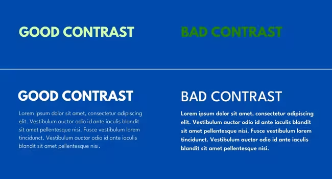
Contrast is one of the most powerful principles in design. It’s the difference between two or more elements in a design, and it helps to create visual interest and draw attention to certain areas.
You can use contrast in various ways:
Color contrast: Light colors against dark colors make elements stand out. For example, white text on a black background is easier to read than grey text on a white background.
- Size contrast: Larger elements naturally grab more attention than smaller ones.
- Shape contrast: Different shapes can break up a design and direct the viewer’s focus.
Contrast is often used to highlight the most important parts of a design, such as a call-to-action button or a headline. A bright red “Buy Now” button against a white background will grab your attention more than if it were in a similar color.
3. Emphasis
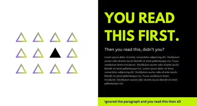
In design, we use emphasis to make certain elements stand out. This principle tells the viewer what to focus on first. You can create emphasis through size, color, or placement.
For example, think of a restaurant menu where the most popular dish is in a larger, bolder font or highlighted in a bright color. This helps customers easily spot what’s recommended.
Emphasis can also come from positioning. An element that’s placed at the top of a webpage or in the center of a poster often gets noticed first. The second image exemplifies how designers can control the flow of information and guide the viewer’s experience using emphasis.
4. Unity
Unity is the feeling that everything in a design works together and belongs together. It’s what makes a design feel cohesive, rather than a bunch of random elements thrown together.
To achieve unity, designers often use similar colors, shapes, or textures throughout a design. For instance, a brand might use its signature colors on its website, business cards, and advertisements. This consistent look makes everything feel like it’s part of one big family, helping reinforce the brand identity.
Unity can also be achieved through layout. A well-organized design that has similar spacing and alignment across elements can create a harmonious experience for the viewer, making it easier to absorb the information presented.
As you can see in the image, you can easily tell that the left image looks more aligned and in unity than the right one.

5. Proportion
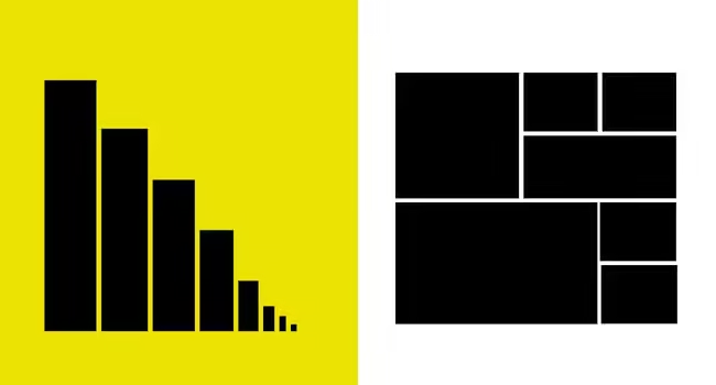
Proportion is all about size relationships. It helps designers convey importance by varying the sizes of elements. It helps to create a sense of scale and hierarchy within a design.
For example, in a brochure, the title is typically much larger than the body text, which indicates that it’s the most important information. Good proportion helps viewers navigate through the content effortlessly.
When elements are proportionate to one another, it creates balance and visual interest as shown in the image below. An effective design uses proportion thoughtfully, ensuring the most important parts get the attention they deserve.
6. Movement
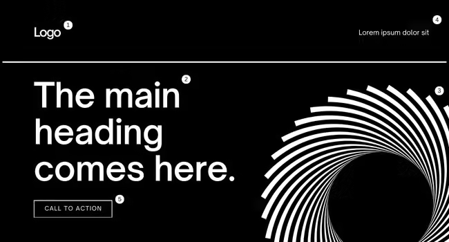
Movement refers to how a viewer’s eye travels across a design. Effective movement guides viewers from one element to another, creating a visual journey. This can be achieved through lines, shapes, colors, and placement.
In graphic design, movement can be used to create pathways for the viewer’s eyes. For instance, an advertisement might use arrows or lines to direct attention to the main offer.
Good movement helps keep people’s attention and makes sure they see the most important parts of your design in the right order.
As we can see in the image below, logo catches our eyes first and then it moves onto the heading and to the shape and so on.
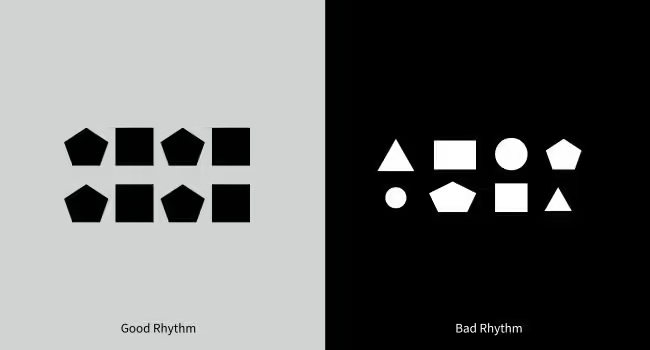
7. Rhythm
Rhythm in design is about creating a sense of organized movement through repetition and variation. It helps to create a flow that connects different elements together. This can be achieved by repeating colors, shapes, or textures at regular intervals.
For instance, you can establish rhythm by repeating shapes, colors, or sizes in a design. Think of a flyer where the main points are organized in a way that alternates between large and small text. This pattern creates a rhythm that can make the content more engaging and easier to read.
When rhythm is used effectively, it can create a sense of movement, leading the viewer’s eyes through the design in a pleasant way. It makes the experience enjoyable and helps reinforce the message.
8. Repetition
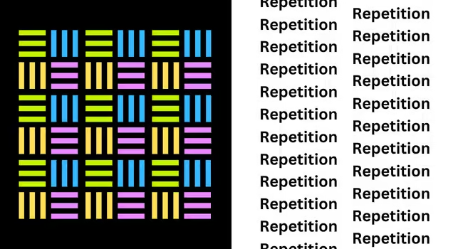
Repetition is a principle that ties everything together. It’s all about using the same elements—like colors, shapes, or fonts—throughout a design to create consistency. When you see repeated elements, it helps you feel familiar with the design.
Repetition can also reinforce a brand’s identity. Think of a logo that appears consistently across all marketing materials—this creates a lasting impression and helps people remember the brand.
By using repetition effectively, designers can build a strong, cohesive visual identity.
9. Variety
While unity is important, too much of it can make a design feel boring. That’s where variety comes in. Variety adds interest by using different shapes, colors, and textures to keep the viewer engaged.
For example, a website might use different styles of images or fonts to add variety while still maintaining a cohesive overall look. Variety keeps the viewer interested and makes the design more dynamic.
Variety can also be used to highlight different sections of a design. For example, using different colors or shapes to distinguish between various categories on a website can help users navigate more easily. When variety is balanced with unity, it creates a dynamic yet cohesive design.
10. Pattern
Pattern is similar to repetition but focuses more on creating a visual texture that can be seen across the design. Patterns can be made from shapes, colors, or images that repeat to create a cohesive look.
For example, a wallpaper design might feature a floral pattern that repeats itself. This creates a pleasing visual effect that can add depth and interest to a space. In graphic design, patterns can be used as backgrounds or to create borders that add flair to a layout.
Using patterns wisely can create a sense of rhythm and unity, as long as they don’t overpower the main elements of the design. Patterns can enhance a design’s aesthetics while also supporting the overall message.
11. Hierarchy
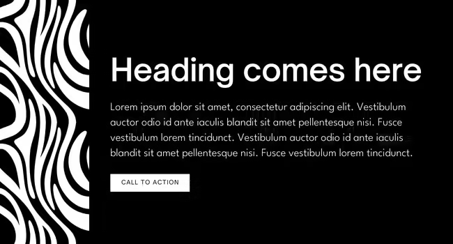
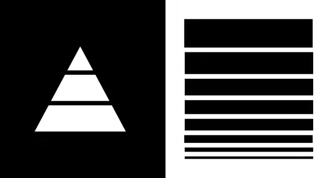
Hierarchy is like a map for your eyes; it shows you where to look first, second, and so on. It’s about organizing elements in a way that indicates their importance. Designers can use size, color, and placement to establish hierarchy.
For example, a website might have a large headline at the top, followed by smaller subheadings and body text. This layout guides the reader’s attention from the most important information down to the details.
Using visual cues like bold fonts for titles and lighter fonts for body text helps create a clear hierarchy, making it easy for viewers to understand the information presented. This clarity enhances user experience and makes the design more effective in conveying its message.
The images below directs our eyes from top to bottom using hierarchy in scale.
12. Alignment
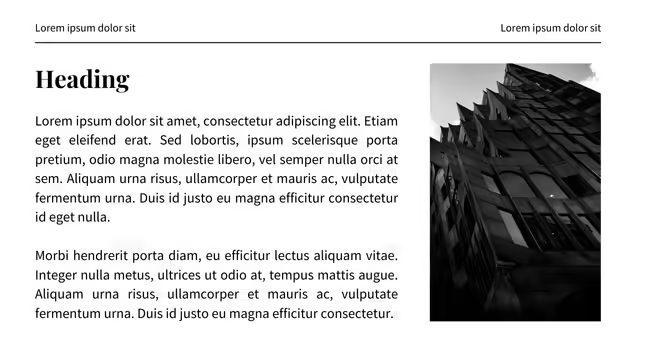
Alignment is all about how we arrange things in a design.
In design, when we align elements—like text, images, and buttons—it helps everything look neat and organized. This makes it easier for people to read and understand what they see.
Proper alignment creates order in a design, making it look clean and professional. If text and images are placed without care, it can create confusion and make it hard to focus on what matters.
For example, a website might have a layout where text and images are perfectly aligned. This creates a clean, organized look that’s easy for users to follow.
13. Space
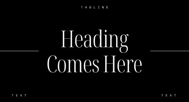
Finally, let’s talk about space, which is the empty area around elements in a design. While it might seem like just “nothing,” it plays a crucial role in design by giving elements room to breathe and preventing clutter, making it easier for the viewer to focus on what’s important.
For example, in a minimalist poster, large areas of space around the text can help draw attention to the headline.
Space also helps establish a visual hierarchy, guiding the viewer’s eye to the most important parts of the design. It creates a sense of elegance and sophistication, making the design feel polished and professional.
Conclusion
By now, you should have a good understanding of the 13 fundamental principles of design: balance, contrast, emphasis, unity, proportion, movement, rhythm, repetition, variety, pattern, hierarchy, and white space.
These principles can be used to create designs that are both memorable and effective in expressing messages.
Keep practicing these principles, and you’ll get better at making great visual content!
Happy Designing!
How Unfog can help you with Graphic design
At Unfog Media, we understand the importance of great design in making a lasting impression. Our team of creative professionals are dedicated to helping you bring your vision to life. Let us help you clear the fog and achieve your goals with clear communication and creative solutions.
Check out our graphic design services and contact us today to learn how we can help your business grow!
